
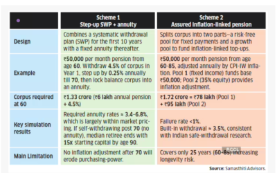
In an earlier write up titled “Why More Equity Won’t Save You from Low Withdrawal Rates”, we explored why high equity allocation in a retirement portfolio does not lead to high withdrawal rates. In the feedback that we received, it was clear that readers find this counter-intuitive relationship between equity allocation and withdrawal rates hard to digest.
Some of you argued that using a bucket strategy, retirees can keep high equity allocations in their portfolio and target better withdrawal rates. We debunked this idea in a subsequent post.
But confusion still prevails. So, in this post, let’s look a little deeper as to why safe withdrawal rates are allergic to high equity allocation. First, we are reproducing here the output from our earlier analysis which shows the relationship between equity allocation and withdrawal rates – the source of controversy !
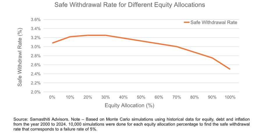
As you can see, withdrawal rates initially benefit from higher equity allocations, but the moment equity exposure starts crossing around 40%, we see a marked decline in withdrawal rates.
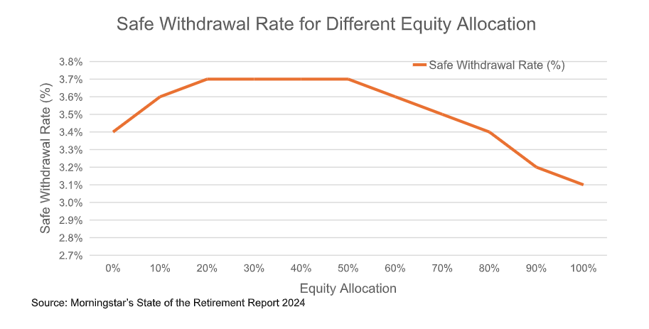
This relationship is not unique to India but has been documented in international safe withdrawal literature as well. For instance, examine the table below from Morningstar’s State of the Retirement Report 2024, which shows a similar trend.
Data shows that equities beat bonds over long periods, so why doesn’t more equity push withdrawal rates higher?
Apart from the reasons we discussed in our earlier writeup, they key reason is that safe withdrawal rates are calibrated to minimise failure rate (which is typically set at 5%). Thus, in simulations, the safe withdrawal rates only care about the worst 5% of the casesand ignores what happens in the other 95% of the cases. This is expected as safe withdrawal rate’s job is to make your retirement “safe”, i.e., minimize failure.
When equity exposure in a retirement portfolio is high, the worst 5% of the cases become worse. Of course, because of equity’s higher return earning potential, the other 95% of the cases become rosier, but that is not what the safe withdrawal rate is concerned with.
An example to illustrate the point
We simulated a 30-year retirement with a safe withdrawal rate of 3.1%. A safe withdrawal rate of 3.1% means that spending in Year 1 is 3.1% of corpus and subsequent withdrawals are increased with inflation.
We assumed that monthly expenditure is INR 1 lakh and the retirement corpus is INR 3.84 crores. (INR 3.84 crores X 3.1% = ~ 12 lakhs p.a. withdrawal, or INR 1 lakh monthly withdrawal)
Below are the simulations results for an equity allocation of 40%.
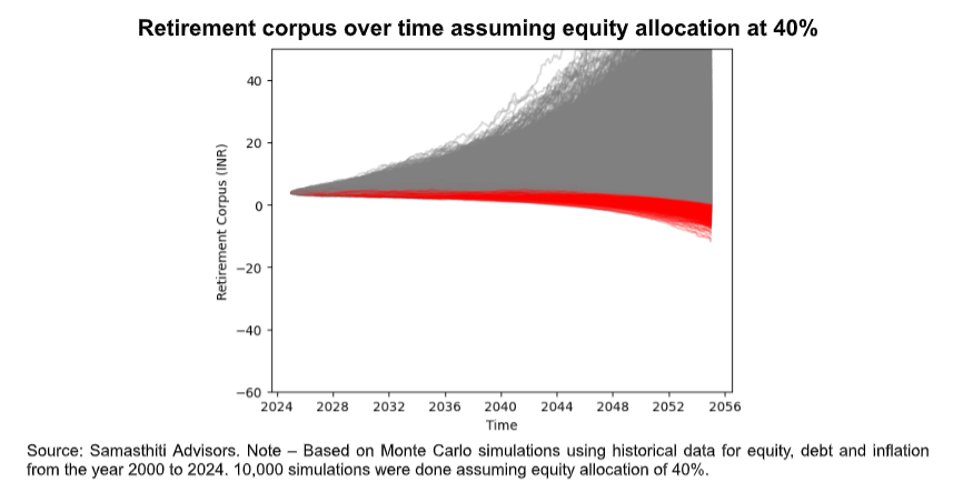
In the above graph, the grey lines are retirement scenarios where the corpus does not exhaust after 30 years. The red lines are scenarios that hit zero and go negative before 30 years (ruin).
Roughly ~5% of paths are red. This is by design as we selected a safe withdrawal rate of 3.1% for a 95% success setting. The worst scenario (the bottom-most red line) ended with a corpus of close to -12 crores. The median leftover corpus was about INR 16 crores.
Now, lets look at how things change when we increase equity allocation to 80% keeping other things the same (retirement corpus of INR 3.84 crores with monthly withdrawals of INR 1 lakh). I have purposely kept the y-axis scale of the graph same as the earlier graph to make for easy visual comparison.
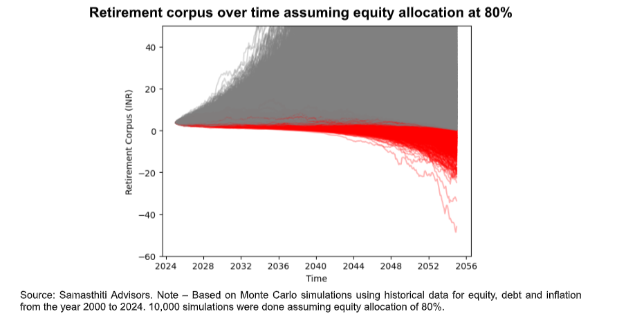
The share of red lines now rises to ~7.5% and they start going more south. The worst scenario (the bottom-most red line) ended with a corpus of close to -46 crores. Ouch!
Also notice in the graph that many grey paths quickly start climbing higher, indicating higher ending corpus values. The median leftover corpus in this case was about INR 44 crores.
Conclusion
The key point we must understand is that safe withdrawal rates typically target ~ 5% failures. If moving from 40% equity to 80% equity pushes the share of red paths from ~5% to ~7.5%, then to get back to ~5% we must lower the withdrawal rate. That is precisely why higher equity doesn’t increase withdrawal rates. Higher equity does boost potential inheritance (the grey lines soar) but worsens the tail (more red lines), and the safe withdrawal rate is more concerned with the tail.
It is also important to note that when you are retiring, you do not know whether you will be on the red path or the grey path. If you want a retirement plan, not a gambling plan, safe withdrawal rates suggest you keep equity allocations conservative to minimize the proportions of red paths.
Equity is a chameleon that sometimes turns red, and safe withdrawal rates hate the colour red. This is the reason the two don’t tango!


Split 80% equity into 30% gold and 50% equity. Now Run the simulations and publish the results. I know Ravi is a scholar. But there are gaps in his analysis. This is one of them.